The Pixel Clinic · Visit 03: the cardigan with an extra button
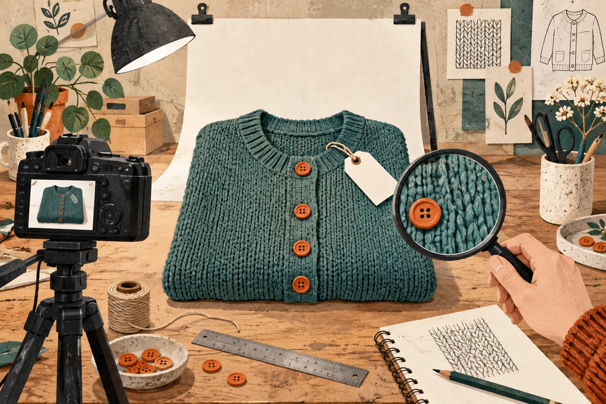
The product looks good in person. On the shop page, it appears to have been photographed through cling film. You try an enlargement so buyers can see the fabric. The software is enthusiastic: it adds some texture, polishes the buttons, and occasionally takes an interest in product design.
When you upscale product images, the real item is the reference. A cleaner picture helps only if the customer still receives the thing shown in it. That means inspecting material, color, lettering, and construction—not just enjoying a larger preview.
This workflow starts with one representative photograph. Our cover and diagrams are illustrations; they are not photos of an actual listing or SeedVR2 before-and-after results.
Check whether the source is actually too small
Open the original image outside your shop's theme. Compare it with the page. Sometimes a tiny thumbnail is being stretched into a large hero image while a perfectly good full-resolution photograph sits unused in the media library.
Check the image's pixel dimensions, the file actually loaded by the page, and how large it is displayed. A browser's responsive image choice or a low-quality export can be the problem. Enlarging the wrong derivative adds work without fixing the original delivery mistake.
If the source itself is soft, identify why. Low resolution, missed focus, camera shake, and heavy compression are different defects. The blurry photo guide helps separate them. Where a sharp photography original exists, use it. Where crucial product details were never recorded, a new photograph may save time.
Choose a sample that can catch you out
Pick a product with fabric or surface texture, a distinctive color, a label, and a few small components. A plain white box is wonderfully easy to enlarge and magnificently bad at revealing what might go wrong with the rest of your catalog.
Keep a reference beside you: the actual item, a reliable detail photograph, or the best original from the same shoot. Note the details that cannot change. Four buttons should remain four buttons. A printed word should remain that word, even if a different word would fit more elegantly.
Open the SeedVR2 image upscaling tool, upload the sample, and choose a target suited to your storefront's display and zoom needs. Review the shown estimate, process the image, and download a separate copy. The current interface offers resolution targets and WebP, PNG, or JPG output choices; choose from the controls actually displayed rather than looking for an ecommerce preset.
Inspect four things before saying “looks great”
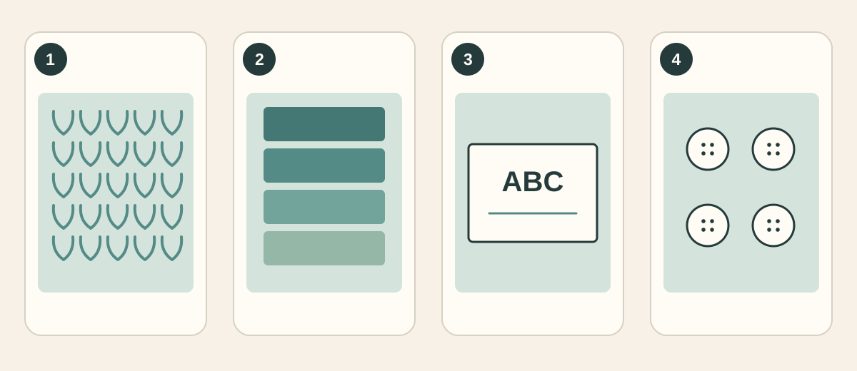
Inspection map: 1 — texture; 2 — color; 3 — lettering; 4 — parts. The diagrams identify checkpoints, not measured improvements.
Material. Compare the same small region at the same displayed size. Are ribbing, seams, grain, and stitching still arranged as they are on the product? A more detailed-looking weave is not an improvement if the model invented a different fabric.
Color. Keep source and result in the same viewing environment. Check that a navy item has not drifted toward black or purple, and that nearby variants remain distinguishable. Also check the final export and storefront; this comparison is a practical warning system, not a replacement for a color-managed photography workflow.
Text and logos. Read the words. Zooming out until the label “looks about right” is not proofreading. If a label carries dimensions, ingredients, or other important information, use a clear original or take a new close-up when the source is unreadable. Do not publish guessed lettering.
Construction. Count buttons, holes, pockets, stones, or other repeated components. Check silhouettes, transparent edges, and reflections. A tidy row of extra stitching may be attractive, but someone will eventually open the parcel.
The texture and diagonal artifact guide provides more detail on inspecting repeated patterns. Keep the physical product or trusted source in the comparison throughout.
Decide whether this version earns its place
| What the comparison shows | Sensible next step |
|---|---|
| Cleaner edges, unchanged product details | Inspect at the final page size and continue to export |
| Sharper image, invented texture or lettering | Reject that version; compare another suitable target or obtain a better source |
| Very little visible difference | Keep the simpler workflow; more pixels alone may not help this placement |
| Missing or unreadable information in the original | Get a better photograph instead of treating an upscale as evidence |
It is reasonable to keep the original image. You do not owe a new file a place in the catalog merely because it took time to produce.
For product feeds, consult the destination's current requirements. Google Merchant Center's image guidance emphasizes accurately representing the product and its variant. A higher-resolution file does not guarantee acceptance by a marketplace or advertising platform.
Give the larger image an actual job
Different placements need different crops. A listing grid has to make the product recognizable quickly. A product page can offer a larger view. A detail crop should show the feature it promises, without quietly cutting away a construction difference.
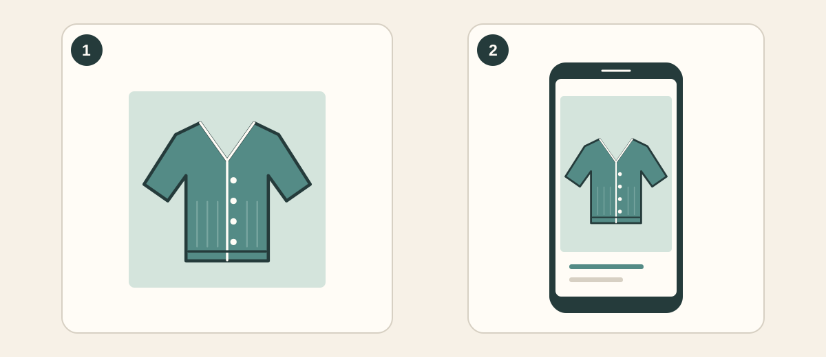
Diagram: adapt the crop to the placement while keeping the important product parts visible. This is a layout example, not a store screenshot.
If a picture is displayed at 600 CSS pixels wide, a 1200-pixel-wide delivery image is a useful starting candidate for a 2× display. That is an example, not a universal platform specification. Your theme, zoom behavior, screen density, and image pipeline determine the final requirement.
Keep a high-quality master, then make delivery copies. PNG can be useful when lossless storage matters; JPG and WebP are common choices for efficient photographic delivery. Format alone does not guarantee a good image: compare the exported file and its weight.
Avoid opening a lossy delivery copy, editing it, and saving another lossy generation each time a new placement appears. Return to the master. If the same photo is also headed for a printed catalog, use the separate image enlargement for printing guide to calculate that requirement.
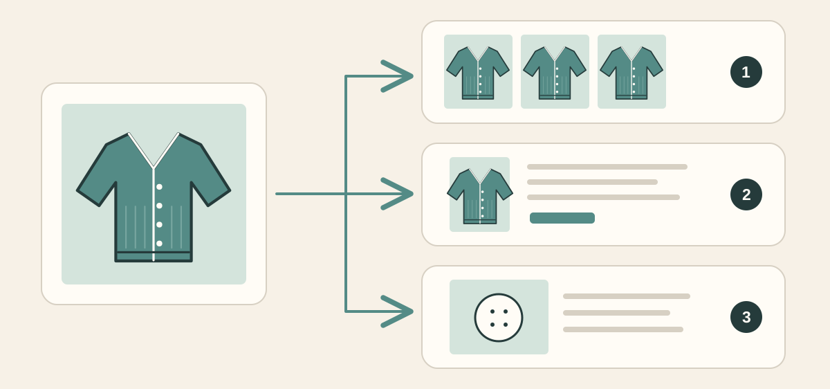
Diagram: one master can supply several appropriately sized delivery copies. The biggest file need not be the one every shopper downloads.
Approve the sample on a phone, too
Open the actual storefront preview. Check the grid tile, full product page, and zoom view on a phone as well as your desktop. Confirm the correct image is loaded, the crop is useful, the lettering is readable where it needs to be, and the file size is reasonable for the placement.
Once a sample passes, keep a short checklist for the remaining images: correct item and variant, believable material, unchanged text, unchanged construction, suitable crop, checked export. Inspect each result; one good sample does not approve an entire catalog automatically.
Start with the product that will expose the most problems: upscale one representative product photo. Read the label, count the buttons, and decide whether the new file is genuinely more useful. Your customers are buying the cardigan. The extra button was never part of the offer.
More from The Pixel Clinic: Old videos without excessive restoration · Anime video without damaged line art.