The Pixel Clinic · Visit 02: the suspiciously muscular subtitle
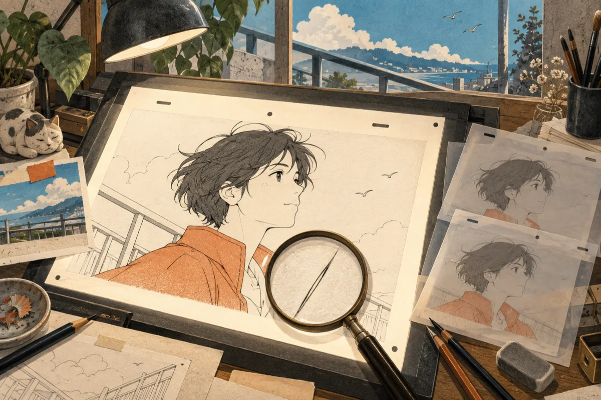
You put an old animation on a bigger screen. The character's outline has acquired a white halo. Add more sharpening and the eyelashes start competing for top billing. The subtitles appear to have joined a gym.
To upscale anime video well, look beyond the dimensions in the file properties. A drawing depends on deliberate lines, flat colors, and the relationship between one frame and the next. Making a line thicker can change an expression; inventing texture can change the medium.
Here is a way to judge a short test before committing to a longer video. The images below are editorial illustrations and schematic examples, not benchmark results or claims about a particular model's output.
Give the test something difficult to draw
Start from the cleanest source you have permission to use. A higher-quality official export or your own animation master is a better starting point than a screen recording or a repeatedly compressed clip.
Select five to ten seconds that contain several useful stress tests: fine hair, a diagonal railing, a slow background pan, a smooth sky, and subtitles if the source has them. You may need two excerpts if one scene does not cover both line work and movement.
Before processing, write down what should stay unchanged. Perhaps the hair has three visible spikes, the jacket is a single flat color, and the sign contains readable lettering. These small observations are much more useful than “make it look better,” which is how a quiet sky ends up with an unsolicited texture budget.
First, inspect the lines
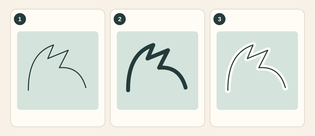
Diagram: 1 — a deliberate thin line; 2 — a heavier line; 3 — an edge with a halo. These are drawn examples, not processing comparisons.
Compare the source and output at the same viewing size. Look closely at eyes, mouths, thin strands, and where lines intersect. Ask whether the output preserved the original shape, not merely whether the edge looks more contrasty.
| Area | A useful question |
|---|---|
| Hair tips and eyelashes | Are separate strokes still separate? |
| Eyes and mouth | Has extra thickness changed the expression? |
| Diagonal rails and background lines | Are edges continuous, without new stair steps or breaks? |
| Outline against a bright background | Has a light or dark ring appeared beside it? |
View the same region both at normal playback size and magnified. Extreme zoom helps reveal artifacts, but the final viewing size tells you whether they matter. The diagonal artifact guide covers related edge and pattern problems.
Then, inspect the places with almost no detail
Flat color is a design choice. It does not need rescuing just because a model can imagine a more elaborate surface.
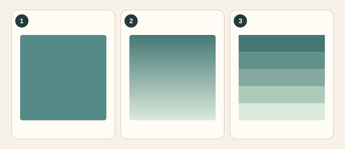
Diagram: 1 — flat fill; 2 — smooth gradient; 3 — visible bands. Judge the output against the intended source, not against a rule that more texture is better.
Check cheeks, shirts, walls, and skies. Does a painted gradient remain gradual? Has a solid region acquired crawling speckles? Are compression bands being emphasized? Also check whether colors shifted after export or playback; apparent improvement on one display can hide a different delivery problem.
Some animation includes intentional grain or textured backgrounds. Keep those distinctions: a hand-painted wall and a flat-colored face need not become equally smooth. The source artwork gets the deciding vote.
Make one controlled upscale
Open the SeedVR2 video upscaler and upload your short excerpt. Choose an available target that suits the source and intended screen. The interface offers 720p, 1080p, 2K, and 4K targets; the sensible choice depends on the input, not on an obligation to click the biggest number.
Check the estimate shown before running the task. Download the completed sample and compare it with the same source excerpt. If trying another target, start again from the prepared original rather than enlarging the first output a second time.
The workflow does not depend on a special “anime mode,” a hidden line-art slider, or a promise of perfect flicker removal. Those are not controls this guide asks you to find. It depends on choosing a representative sample and checking what actually changed.
For source-size and output-size decisions, see how to upscale video to 4K. Keep the original frame rate during the initial comparison; experimenting with frame interpolation at the same time makes it harder to identify the cause of a new defect.
A good screenshot still has to survive playback
An individual frame may look excellent while a thin line changes thickness every few frames. Your eyes notice that instability even if the sharpest screenshot looks impressive.
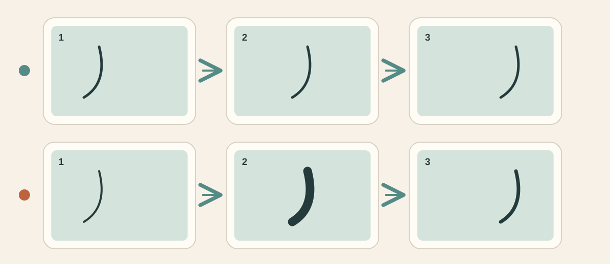
Diagram: the upper row keeps a moving line consistent; the lower row changes its thickness. This illustrates what to watch for in motion; it is not a real video test.
Watch at normal speed first. Then loop a short passage containing a pan or moving head. Check hair strands, background grids, fabric patterns, and subtitle edges. Advance through several adjacent frames when something catches your eye, rather than judging unrelated frames from different moments.
Animation may deliberately hold drawings or use stepped motion. Do not mistake the original timing for a problem that must be smoothed away. If a result starts looking like a different production, being technically larger is not much consolation.
If the source has interlacing or an incorrect display shape, prepare it first; the old-video restoration guide explains that part of the workflow.
Read the subtitles before approving the credits
Burned-in text is part of the image. An upscaler may clarify readable shapes, but it cannot reliably recover exact words from an illegible source. Check small punctuation, accents, and outlines. Crisp nonsense is still nonsense, now with excellent posture.
If you control the editing project and have separate subtitle files, keep the text separate and render it at the final delivery size where practical. If the only available copy already has embedded text, inspect that copy carefully and seek a better source when lettering is too damaged.
Before approving the test, check five things: line shape, flat color, gradients, text, and motion. All five should remain acceptable. A moderate output that preserves the drawing can be preferable to a sharper version that quietly redraws it.
Use a representative excerpt to test your anime video upscale. Once that sample holds up in motion, you have a much better basis for deciding what to process next.
More from The Pixel Clinic: Restoring old family videos · Enlarging product images faithfully.